


If you ever have used a theme or script, you will often see an element with various classes attached to that element; such as ‘<div class-=”red black”>’. As you may have already expected, the element makes reference to the red and black classes.
That is the easiest part while applying the style to the element is only a little more involved. If the single element contains 2 classes, how is the style interpreted from the stylesheet? To make this a little more clear, add the code below to the final stylesheet.
As you can see below, the element can access all 3 colors. But, the priority is top down for the single classes while the reference using .black.red takes precedence. Thus, the actual color of the text is blue even if you moved .black.red to the top. But, if you deleted .black.red and shuffled the order for .red and .black you will see that color will change to reflect the last single class.
<style>
    .black{color:black}
    .red{color:red}
    .black.red{color:blue}
</style>

<div class="red black">My Text</div>
Now, try the code below. As you can see, the color is now red, because red overrides black and the use of !important will stick unless it is overridden by another !important.
<style>
    .black{color:black}
    .red{color:red !important}
    .black.red{color:blue}
</style>

<div class="red black">My Text</div>
Finally, try the code below. As you can see, the color is blue as you may have expected.
<style>
    .black{color:black}
    .red{color:red !important}
    .black.red{color: blue !important}
</style>

<div class="red black">My Text</div>
Now, for one little twist. Move the .black.red above .black so it looks the block below. As you can see, .black.red !important overrides anything below. Also, if you had the same order without !important, the text color would be blue too.
<style>
    .black.red{color: blue !important}
    .black{color:black}
    .red{color:red !important}
</style>

<div class="red black">My Text</div>
After browsing around the web, looking a perfect solution for making all bootstrap columns the same height, I ended up crafting a custom solution because all the options I pursued were incomplete. Why incomplete? Well, using a simple Jquery solution to take the tallest column and make others the same height was short and sweet and looked great on an Ipad, Laptop and PC, but, when it came to the phone, using the largest column left too much unwanted space on the shorter column(s).
So, here is what I did. I chose the break point width of 768px to be mark where I would only want the Jquery to execute making the columns the same height. Since the columns had custom color backgrounds with text, they did need to be the same height when side by side or the layout would look off and lack symmetry.
Method A
Within the row class, the added a class called inner-top to each of the columns. In my case, it was 2 columns, but that could easily be adjusted to three, if needed. Here is a quick synopsis of the code below. The script will get the width of the window from the device being used. Do note that there are two ways to achieve this; one being $(window).width() and the other screen.width. It is important to remember that the latter actually detects your device with while the former detects browser width which in some cases could be wider than the device width.
If the device has the larger view port where columns will be shown side by side, we find the height of the desired columns of the inner-top class. The eq() method is used to get them. The first column from the top of the source code is eq(0) and the second is eq(1).
Once the dimensions are found, a simple if and else statement will apply the width from the largest column to the smaller column.
In addition, the page will reload if it is resized so that they will maintain the proper heights.
<script>
    $(document).ready(function () {

        width = $(window).width();
        //width = screen.width;
if (width > 768) { var first = $('.inner-top').eq(0).height(); var second = $('.inner-top').eq(1).height(); if (first > $('.inner-top').eq(1).height()) { $('.inner-top').eq(1).height(first); } else { $('.inner-top').eq(0).height(second); } var imageDiv = $('.inner-top img').eq(1).height(first); $('.inner-bottom').each(function (index, value) { if (index == 0) { var newHeight = $(this).height(); $('.inner-bottom').eq(1).height(newHeight); } }); } $(window).resize(function () { if ($(window).width() > width || $(window).width() < width) { window.location.href = window.location.href; } }); }); </script>
Method B
For those who find the method above a little redundant, you can use the map() method below to grab all heights of the inner-top class and make the class take on the height of the largest column.
<script>
    $( document ).ready(function() {

        width = $(window).width();

        if (width > 768) {
            var all_heights = $(".inner-top").map(function () {
                    return $(this).height();
                }).get();

         maxHeight = Math.max.apply(null, all_heights);
         $(".inner-top").height(maxHeight);

 }


 $(window).resize(function () {

 if ($(window).width() > width || $(window).width() < width) {
 window.location.href = window.location.href;
 }
 });

});

 </script>
Method C
This method uses a bootstrap class called row-eq-height. Thus, the row like
<div class="row"> becomes <div class="row row-eq-height">
In some cases, Bootstrap may not have included the class, thus, it is shown below. When using this class, you may not be home free since the row may not stack the columns on top of each other as you expect on the smaller devices. Again, you could add a simple piece of Jquery that would remove the class when the device is less than 768 px.
.row-eq-height {
    display: -webkit-box;
    display: -webkit-flex;
    display: -ms-flexbox;
    display:         flex;
}
The code to remove the class is shown below. Again, you see the window will reload in order to make it look right if someone resizes the page.
<script>
    $( document ).ready(function() {

        width = $(window).width();

        if (width < 768) {
            $(".row").removeClass("row-eq-height");

        }


        $(window).resize(function () {

            if ($(window).width() > width || $(window).width() < width) {
                window.location.href = window.location.href;
            }
        });

    });

</script>
This topic comes from a scenario for which a web developer decides to learn and understand CSS frameworks Like Bootstrap and Skeleton. After 3 years of dominantly programming PHP / mySQL applications and working mostly with static templates at work and some old school fluid templating, I began to build some responsive web applications and a handful of websites that used these frameworks.
Since the css classes were so sensitive, I kept modification of the template simple; such as removing unwanted divs that contained the ‘row’ class.
At first, I was intimidated because I remember someone with weak HTML / CSS skills struggling with it daily. With a quick look under the hood, it was quite different than typical CSS coding and the classes and new tags were unfamiliar and the floating methodology was new at the time.
Although using a CSS framework was a little intimidating at first, a light did eventually go off after coding with them on various occasions. All of a sudden, not only did these responsive frameworks make websites display so conveniently on all devices, but, actually coding a web application with them became easier with them than coding with traditional CSS.
The reason for the simplicity was the modular aspect of a CSS framework and the power of the classes. In many cases, the classes do great work and that minimalizes minor styling touch ups, if not at all. On occasion, you may want to add an id to an element that has a class, add some custom css, then move on.
Suddenly, the layout and each ‘row’ class and its subset of columns was so easy to work with and to use with PHP / mySQL.
Essentially, the bottom line is that using a Framework like Bootstrap or Skeleton can make your web pages look good and clean without taking a lot of time to achieve this effect. Thus, this allows for many instances to bypass any web design extras, asides from spending $5 here and there on Fiverr, Shutterstock and Fotolia for quality images.
Alternatively, using a framework can allow you to know how long a web designer should be able to complete tasks, if you decide to use one.
Some of the built in features to CSS frameworks are Font Awesome and icons. Using special class names will provide you with some extra styling as needed.
Below are some basic links to get you started with Bootstrap.
LINKS
Bootstrap and Skeleton Frameworks help you create responsive websites very quickly and easily. With this brief lesson, you will be shown some very basic tips for creating and working with the Bootstrap framework.
Using the Framework
In order to use the Bootstrap Framework, you need to download it from http://getbootstrap.com/ and move the core folders into your document root. Thus, you will have the three folders; css, fonts and js.
The next step is to add a link into the head of your HTML file.
<link href="css/bootstrap.min.css" rel="stylesheet">
At this point, you can start using Bootstrap. Since this is a very basic tutorial, I will attempt to explain the very basic classes that can be used to give solid, desirable, responsive results.
Container Class
The container class is the parent class that holds everything together and normally exists after the opening ‘<body>’ tag. It is a one time deal.
<div class="container">
</div>
Row Class
The row class contains a responsive group. Think of it like a class that holds one or more columns and puts them in order for a specific screen size. The first row can be used to create columns and a sidebar for the entire document.
You can have as many row classes as you want and they will present themselves to the viewer in the same order they are coded. Thus, if the first ‘row’ class has two columns and the second class has three columns, you will see all items of the first row class appear before you will see any items of the second ‘row’ class.
For example, on a home PC, you may see the first row class with 2 columns followed by the second row with 3 columns while the mobile phone user may see 7 single columns; all in order as they are coded.
In order as coded means that the first column in the ‘row’ class always appears first, followed by the second and so forth.
<div class="row">
</div>
Column Class
The column class, or classes, are children classes to the ‘row’ class. They are name with ‘col-md-*’. For example, they could named something like ‘col-md-12’, ‘col-md-6’, ‘col-md-4’.
The key to using these classes are to remember that all children classes that are used must add up to 12. For example, If you plan to have two columns, you would have two classes that are both named ‘col-md-6’. Meanwhile, a three column layout would use ‘col-md-4’.
The code belows shows a column that would expand the entire width.
<div class="col-md-12">
</div>
Putting it all together
<div class="container">

    <div class="row">

        <div class="col-md-12">
        </div>

    </div>

</div>
Other Possibilities
With those basics in mind, you can create layouts with multiple columns. To go one step further, you could make custom layouts within a row. Thus, you could have a large column that represents the main body with a class like ‘col-md-8’ and a sidebar with a class like ‘col-md-4’.
Below, is another example to create your main page and sidebar. This example uses the wrapper id, sidebar-wrapper-id and page-content-wrapper id.
<div id="wrapper">

    <!-- Sidebar -->
    <div id="sidebar-wrapper">
    </div>

    <!-- Main Page -->
    <div id="page-content-wrapper">
        <div class="container-fluid">
            <div class="row">
                <!-- Main Body Goes Here -->
            </div>
        </div>
    </div>

</div>
This tutorial will help get you up and running with the popular Bootstrap framework so that you can quickly create ad edit responsive websites using these tools.
1) Download from http://getbootstrap.com/getting-started/
The basic download will contain 3 folders; css, fonts and js while the source code will have a folder called ‘less’ which contains the ‘.less’ files for which can be coded using LESS pre-processor.
Although it is very easy to use the basic download that contains CSS files, using LESS has many advantages, especially on some projects where you want to use extra features like variables.
For example, setting a variable like @green : #1ed84a is much easier to reference than trying to remember a color for a new class or using a tool like ColorZilla to find a color.
The code below shows how easy it is to create the variable @green that can be used to represent a typical hex code #1ed84a. Two classes are shown below; one using LESS, the other using a conventional css class.
@green : #1ed84a
.my-class-less{color:@green}

.my-class-conventional{color:#1ed84a;}
When you work with LESS files, you have a couple of of options. Option number one is to add links to the document head and the other is to dowload a free compiler and do them on your own PC.
If you compile them on your own PC, they ‘.less’ file extension will get converted to the ‘.css’ format with the same name. Thus, bootstrap.less will be the working file that will create a browser copy called ‘bootstrap.css’.
<link rel="stylesheet/less" href="css/bootstrap.less">
<script src="js/less.js"></script>
After you downloaded the Source Code from the Bootstrap website, you can use your compiler right away. This will be covered shortly in detail.
To keep it simple, create a css folder within the parent folder that contains subfolders like dist, docs, fonts, grunt, js and less.
1) Open the Winless program.

Setting up an HTML 5 website is very simple. The typical page will have doctype declaration at the top of the page. For html 5, the doctype is ‘<!DOCTYPE HTML>’. After declaration is the opening html tag which is displayed as ‘<html>’.
After the opening html tag are the <head></head> tags. Within the head tags you can add your links to javascripts and css files.
After the head tags comes the opening body tag which is displayed as ‘<body’. After the body tag is where the typical coder goes to work. The stuff you see in the browser comes from this section. Often, tags like <div>, <p> <form> and plain old text is found here. You can select ‘View Source’ within your browser to compare the code in the page to the code you see in the browser.
The body finishes with a closing body tag which is shown as ‘</body>’.
Following the closing body tag is the closing html tag. The closing html tag looks like ‘</html>’.
That is all there is to a basic html 5 web page.
 <!DOCTYPE HTML>
<html>
<head> <!-- all links to scripts; such as: <link rel="stylesheet" type="text/css" href="theme.css"> --> </head>
<body> <!-- all content goes here; such as <div></div>, <p></p>,<ul></ul>,<form></form> and plain old text --> </body>
</html>
Within the past couple of years, ‘responsive’ has been quite a buzzword around web designers and developers. Responsive web design is modern styling which presents web pages to custom fit any browser and device. It is the new method to create one website which looks great on all devices. Previous to responsive web designs, fluid templating and mobile web designs had been used to create websites based on screen widths. The concept is so good that it is very unlikely that responsive web design is a fad; but rather a new standard and methodology that should stand the test of time. However, unlike other methods; html and css coding uses new coding properties.
The easiest method to adopt to using responsive methods is to buy good, stylish responsive templates and alter them as desired. For as little as $10, you can buy templates with images and various pages of html / css styling. Furthermore, html / css templates are often very well coded and commented. Unless you have an excellent artistic talent; chances are that you cannot style like the pros who are very skilled and do it every day. Also, using pre-existing templates will allow you to complete projects and troubleshoot coding at the same time and possibly have a forum which explains how the template can be modified.
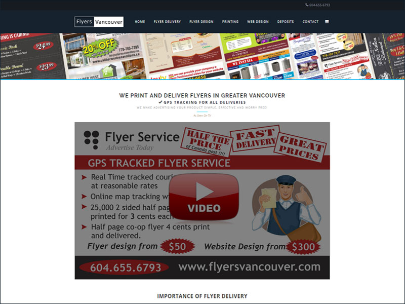
Here is an example of a responsive template used within a custom cms. View Webpage.
Open the example webpage listed above and slowly narrow the browser window. Then, view the web page on a mobile device such as the iphone. As you can see, the responsive templates adjusts top fit any window, some images shrink as the window becomes smaller, and some content just gets left out as the screen gets smaller. With this example, this responsive template was used with Sitemakin CMS. After a simple upload of the images and css; and a copy and paste of the index.html code, the template was ready for modification and the website was viewable on the web.
When you work with css and many divs nested within div tags, you will often want to use the background of the parent div. The transparent background makes this fast and simple.
To inherit background within a nested div,
background:transparent;
When you build a website, it has a DTD at the top of the page which declares the type of document for the web page. These days, most web pages use various declarations for html and xhtml. Below, are two code samples for the most common types of xhtml documents and the html 5 document. Aside from the DTD, the html, body and head tags are the same.
XHTML Transitional Sample
<!DOCTYPE html PUBLIC "-//W3C//DTD XHTML 1.0 Transitional//EN" "http://www.w3.org/TR/xhtml1/DTD/xhtml1-transitional.dtd"> <html xmlns="http://www.w3.org/1999/xhtml" xml:lang="en-gb" lang="en-gb" > <head></head> <body> </body> </html>
XHTML 5 Sample
<!DOCTYPE HTML> <html> <head></head> <body> </body> </html>
The code below can be used to set an image in the background that will stretch and fit the width of various computer monitor sizes.
Larger images like 2100 x 500 help insure the centered look look good in all monitors.
Here is a little snippet which allows you to print a page. When the print button is selected, you will be able to select a print, adjust settings(if desired) and print the page.
<div>
<form class=’do_no_print’><input type=”button” value=”Print Page”
onclick=”window.print();return false;” /></form> </div>
<div>Print the content of the page.</div>
You can make a background color transparent withthe following css properties.
There could come a time when you want to align a DIV tag in the center of another div or the webpage. The code align=center can be added to the opening DIV tag to accomplish this.
Below is a class that can be used on a list elemen.
a:link.alex_link
{
color:orange;
text-align:left;
text-decoration:none;
font-family: Helvetica,Arial,sans-serif;
font-size:15px;
}
The code below would execute on a visited link with the class name alex_link.
a:visited.alex_link
{
color:orange;
text-align:left;
text-decoration:none;
font-family: Helvetica,Arial,sans-serif;
font-size:15px;
}
Code for a custom image submit button:
<input id=”my_search” type=”image” SRC=”images/my_image.jpg” height=”25″ width=”75″ border=”0″ alt=”Submit Here”>
There are several ways to add css to a td cell with css. One simple way is to give the form or table row (tr) a specific id. Then, you can use that id with reference to a cell ‘td’.
\
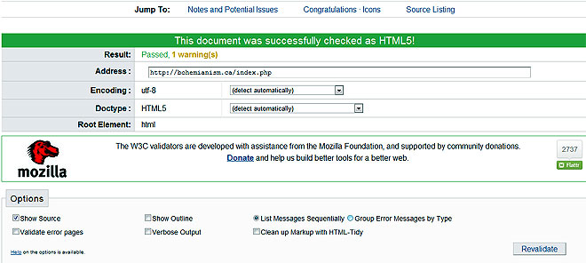
When you test a page for validity online at W3C validator, you will see success or a list of errors.
If you receive a list of errors, you can find out where it is.
The code below is 2 separate fluid blocks that will be used in a fluid layout. With the code, the left block will be 50% of the width and the right would be 48%. The other 2 % is just a little space in the middle which goes unnoticed. When a large desktop monitor views the fluid web page, the 2 blocks stretch to fit the screen. The images and text all fit in proportion.
<div style=”display:block; float:left; margin-left:0px; padding:0px 5px 0px 0px; width:30%;”>
<div style=” padding:0px 5px 0px 5px; width:auto; height:70px; margin-top:0px;” ><br /><b><span style=”font-size:16px;”>TITLE 1</span></b> <br />Lorem ipsum dolor sit amet, consectetur adipisicing elit</div>
<div><img style=”float:left; padding:0px 5px 0px 5px; margin-top:10px; width:100%; height:auto;” src=”images/image1.jpg” alt=”google voice”/></div>
</div>
<div style=”display:block; float:left; margin-left:0px;padding:0px 5px 0px 0px; width:30%;”>
<div style=” padding:0px 5px 0px 5px; width:auto; margin-top:0px; height:70px;” ><br /><b><span style=”font-size:16px;”>TITLE 2</span></b> <br />Lorem ipsum dolor sit amet, consectetur adipisicing elit</div>
<div><img style=” padding:0px 5px 0px 5px; margin-top:10px; height:auto;width:100%;” src=”images/image2.jpg” alt=”web”/></div>
</div>
<div style=”display:block;float:left; margin-left:0px; padding:0px 5px 0px 0px;width:30%;”>
<div style=”padding:0px 5px 0px 5px; width:auto; margin-top:0px; height:70px;”><br /><b><span style=”font-size:16px;”>TITLE 3</span></b> <br />Lorem ipsum dolor sit amet, consectetur adipisicing elit</div>
<div><img style=”padding:0px 5px 0px 5px; margin-top:10px; width: 100%;” src=”images/image3.jpg” alt=”web” /></div>
</div>
</div>
<div style=”display:block; width:48%; float:right;”>
<div style=”float:right; width:100%; padding:10px 10px 0px 10px; display:block;”><code style=” margin:2px 0px 2px 0px;”><span style=”color:#dc4000;”><b>HEADING 1</b></span><br/>Lorem ipsum dolor sit amet, consectetur adipisicing elit, sed do eiusmod tempor incididunt </code></div>
<div style=”float:right; width:100%; padding:10px 10px 0px 10px; display:block;”><code style=” margin:2px 0px 2px 0px;”><span style=”color:#dc4000;”><b>HEADING 2</b></span><br/>Lorem ipsum dolor sit amet, consectetur adipisicing elit, sed do eiusmod tempor incididunt </code></div>
<div style=”float:right; width:100%; padding:10px 10px 0px 10px; display:block;”><code style=” margin:2px 0px 2px 0px;”><span style=”color:#dc4000;”><b>HEADING 3</b></span><br/><b>Call 555.555.5555</b> Lorem ipsum dolor sit amet, consectetur adipisicing elit, sed do eiusmod tempor incididunt</code></div>
</div></div>
The image below will resize image and page layout expands or decreases since image width is a percentage.
<div><img style=”float:left; padding:1px; width:32%;” src=”images/image1.jpg” alt=”Alt Text”/></div>
The image below will not resize in a fluid layout since width is not a percentage. In this case, no width is defined so it takes on its actual size.
<div><img style=”float:left; padding:0px 10px 0px 10px;” src=”images/image2.gif” alt=”myAlt Text”/></div>
When using lists, it is very important to make sure that the bold and anchor tags reside inside the <li></li> tags so the lists will look proper in all browsers.
Proper order for links and bold text within a list element.
<li ><b><a class=”list” href=”mypage.html”</a></b></li>
Improper Order
The order below has white space before and after a list element which will cause undetectable spaces with Internet Explorer. The code would look fine with other browsers.
<b><li ><a class=”list” href=”mypage.html”</a></li></b>
Two methods to create colored text styling with lists that are links.
Styling text color in a list using css class.
<ol><li>
<a class=”list” href=”page.html>Link Text</a></li></ol>
METHOD B:
Styling override or styling a list element.
The specific anchor is styled where it is.
<ol><li><a style=”color:blue;” href=”page.html>Link Text</a></li></ol>
Ordered lists can be styled in the tag or in a stylesheet. Each method has pros and cons. The code below shows examples for creating styling to <li></li> tags.
Example:
<ol style=”list-style-type: lower-alpha;”> <!– makes list items with lower alpha characters –>
<li>Item A</li>
<li>Item B</li>
</ol>
Unordered lists can be styled in the tag or in a stylesheet. Each method has pros and cons. The code below shows examples for creating styling to <li></li> tags.
Example:
<ul style=”list-style-type: none;”> <!– makes list items with no characters or overrides stylesheet –>
<li>Item A</li>
<li>Item B</li>
</ul>
When using css classes and ids, using ids when possible always alllows direct styling to the desired elents. But, there may come a time when you want to substyle elements; such as color coding specific link. Although you can use ids, you may want to use classes. When using classes, all children will inherit the color and styling of parent classes, until specified otherwise. For example, you may want alkl the same styling except for font color.
For example, the parent would have been a class called .myart-block-body and the link would have been written like:
.myart-block-body a:link
{color:blue;
}
If you want to assign a subclass called sublevel to make a white link, the code would like:
.myart-block-body a.sublevel:link
{
color: #FFFFFF;
}
Although surfing the web with a mobile device is like trying to surf small, mushy waves with a gun (or surfing large, hollow tubes with an egg), the fact that it is getting so popular should raise a few eyebrows to web surfers, web designers and web developers.
Setting up for all devices is matter of creating redirects based on what device is being used by the web surfer.
Since the mobile web can take full advantage of displaying code written with html, css and Javascript, adopting a plan to create various templates based on these credentials is an obvious starting point.
For database driven websites, you can utilize php / mySQL since the browser output will interpret the code to html, css and Javascript.
The codes to create redirecting based on screen size is:
Since some users (a tiny minority) may disable Javascript, you can always add a meta tag within a noscript tag to redirect the user if they do not have Javascript enabled. Here is the code:
<meta http-equiv=”refresh” content=”2; URL=http://www.mysite_for_no_javascript.com”>
</noscript>
At this point, you have 3 options:
1) Create a single mobile version that is the perfect size in a device like the iphone, but needs scrolling in other devices.
2) Create one small version that is viewable in all deveices with a screen less tghan 300px.
3) Create various sizes for various devices.
Explorer stylesheets of any version can be simply added to most index.php files with:
There may come a time when you want to disallow horizontal scrolling in the browser. One reason may be that you use a fluid template. Another reason could be that it looks messy if someone scrolls to the right.
Simple, you can go to the CSS stylesheet and write the following in the body id or class.
overflow-x: hidden;
Now, you can reload the page and the horizontal scroll bar should be be gone.

Owner of Fullstack Web Studio
Quality Coding

Digital Marketing
When Performance and Flexibility Matters
Affordable web design,custom web development and mobile apps for individuals and businesses.


Let us analyze your data and competition to acquire more traffic! Professional SEO content writer
© 2018 ALL Rights Reserved | Sitemap
Vancouver | North Vancouver | Burnaby | Richmond | Coquitlam | Port Coquitlam | Surrey | Langley | Maple Ridge | Mission | Abbotsford | Kamloops | Kelowna | Victoria | Squamish | Whistler | Pemberton